Once again I am sitting here, on a Saturday wondering what happened last week. Sarah and I decided that it might be best to sit down at the end of the day, or even half way through the day, and then at the end, and write up what has happened. I could not think of a better way to waste time! That said, the photo archive does assist in figuring out what happened. It is unfortunate we can’t tell you everything that goes on due to confidentiality issues but slowly it will come out.
This was a sad week and mummy was heading back to Trinidad on Tuesday the 26th, after staying with Alistair and myself for almost 3 months. Both Ali and I were sad, as was everyone else in the studio, they all grew to love mummy. What is there not to like!
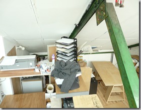
The studio still looked like a bombsite as we waited patiently for the expandable foam to seal most of the cracks that let air in the studio, cold air I might add – it is October! The Twinwall (polycarbonate sheeting for insulation) is on order. Sarah is in her coat as it is so cold upstairs.

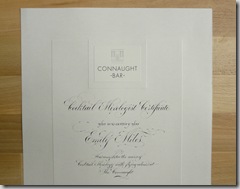
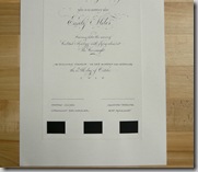
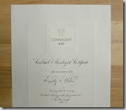
The week started off with a call from Simon and Christina at the Berkeley, needing a certificate for a fantastic idea they are launching. They wanted a STUNNING presentation certificate, and I had the perfect idea in keeping in true Berkeley/Claridges/Connaught style. The basis was a ‘Certificate of Marriage’ we did for Mark Niemierko but with twist. I decided that since an image of the Connaught Bar Logo was needed on the top, encapsulating it would be useful and unlike the ‘Marriage Certificate’ I wanted a sunk plate border here. I extended the embossed border to include the ribbon as well and not to allow the ribbon to leave the sunk area, well, raised in this instance.
We also had some sketches to do for two clients, who can’t be name. Needless to say, one wanted to see a sketch when I had the time and the other needed it in the afternoon of that day. It always surprises me that people think you can solve their problems with design, in a few minutes, as though you are just sitting there waiting on them to call, when they have been grappling with it for days, and in some cases weeks. Calligraphy design is not magic guys! It is hard bloody work! Not to mention, the ink needs to dry before we can scan it! Sigh! So no images unfortunately but if they both come to fruition I will put them up. They were charged for the work. The today for today was also charged the rush rate! Same day is double the fee.
While all of this was going on two things came to conclusion.
I had a lovely chat with Charlotte and Nathalie at Dior as their job was coming to an end. As promised, here is the envelope in our slanted quick script, in white ink on GFSmith Colourplan Ebony. The white is a a monoline pen sent to us by Masayo of the Sakura Pen company. The pen shocked us! It is delicate to write with, great ink flow and brilliant coverage over the black. I can only thank Masayo. They also sent some gold and silver pens for us to test and, like the white, we simply could not anticipate how well they would work.
We used the silver on a job for Antonia at SpecificMedia, another lovely client. She really took the time to talk with us to understand some of the issues with her job. We were asked to use a formal script on the invitations in silver, but as the silver print was thermographed (this is where glue and powders are used to print in), I could not match the plasticity and shine with calligraphy paint (gouache) as gouache is flat and not shiny. We used an upright quick script for the envelopes, this script is based on our formal italic and is almost half the price of the formal hand making it great for addressing the envelopes (higher word count) and the formal script on the invitations. Colour of the week seemed to be black. No image due to confidentiality!
Jessica Carder, who we work with a lot, in her capacity in Communications at Jo Malone, is getting married. I must say, I am probably only a little less excited than Jess! I was so happy to be able to produce something stunning for her and this week the Dark Grey envelopes finally arrived. Her invitations were in our Loose Modern Script supported by our Small Caps. All the stationery was printed at Mount Street Printers. Rachel at Mount Street and I debated on processes.
Jess loves our white on dark grey and was set on that, but I am quite keen to counterchange our colour matching (dark ink on light paper vs. light ink on dark paper), but there is also a hierarchy of stationery one has to conscious of. We decided on to die stamp in white ink on dark grey colourplan (GFSmith), 700gsm card with a sunk plate border. I have tried really hard to capture the raised lettering as well as the sunk plate. I have had to smudge some the RSVP info though will repost once the event has passed.
Little hodgepodge, sorry about that, the black is for Dior and the grey if for Jess.
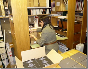
These are Jess’ envelopes and the Dior job getting packed up by Sarah.
One of our other jobs came. Will try to document when we have to do stationery ourselves a little better. I did the text for this job last week and it arrived this week. beautiful menus in our ‘Upright Copperplate’ with names to be written at the top and table names to be done. All done for Kate Cella wedding.
Because I was using a ruling pen for the table names, we thought it would be interesting to post them being made. Have not posted a vid on here so this is test for me as well. If not you can find them at youtube.com/user/PaulAntonioScribe
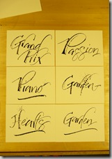
Here are Kate’s Table-Name Cards.We had a call from the team at Liberty wanting some birthday cards done, for the year! There are close to 3000 of them. It is funny how these things happen. Valeria came to see us, she brought the cards, great to write on, thankfully! We were even willing to post them off but the additional bit need to be sent would take too much time for us unfortunately. Not to mention would have increased the cost of the job. Spoke with Veronika and Preets as well and in the end came up with a best price. I do want to take some time here explaining about large jobs. The turn around for that week was also quite tight, today for tomorrow. I have just re-read that, we did not do 3000 of them for the next day! We are doing about 300 a month.
If we have the same text to handwrite, there are no real economies of scale, we don’t write faster, it is not like printing. It is a shame, but that is the way it is so reducing the price based on volume can only ever be a slight reduction.
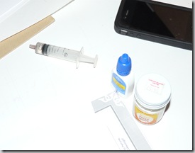
Very itchy eyes! I did try not the mix up the Bleedproof White with the eye-drops.
This week also saw me teaching Keiko some copperplate script and assisting Angelo with his studies in Roman Caps. Angelo has been with me for about 16months now and is progressing beautifully. We had some issues with his caps and I really had to think long and hard as to how to help him along. I decided to get him started on Roman Capitals – specifically pen written ones based on Imperial Caps. As all calligraphers know, not an easy thing. He has really enjoyed it but more importantly I has really helped. He is now moving back to the italic armed with the knowledge of Imperial Capital proportioning.
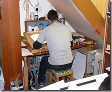
I promised Keiko to develop her copperplate and so this is the beginning of it.
I have some extensive copperplate study sheets and looking at Keiko work on these made me think I need to consolidate them, there are 10 years of copperplate instruction there, making me think it is time to pull my finger out and get that book done! Just not enough time in the day.
Thursday started with the arrival of the Twinwall! Thank goodness. This meant spending Friday pulling apart the upstairs and turning it upside down. I generally try to do any changes on a Friday so there is no disruption to Sarah, as she is not in on Fridays, but it is back to normal in time for her to start work on Monday! Needless to say, she was looking forward to a warm studio, so was I. Heating is not cheap! I cannot tell you how much I appreciated Angelo’s assistance here. Talk about experiencing the true side of being an apprentice.
The Twinwall was HUGE! 3.5 x 1m. Getting it upstairs was a chore.
The curtains have been here for about 4 years and kept the studio warm, but it also kept the place dark. Needless to say they all came down, again. I had to put them back up as it was starting to get too cold between the foam drying and the twinwall arriving. Angelo started cleaning the glass
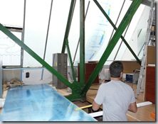
Once cleaned we prepared to start cutting the sheets to fit into the panes of glass.
Thursday also saw the arrival of out new fandangle A3 Cannon IX4000 printer!
There he is awaiting connecting and installing. Angelo simply could not wait to play with this.

The week ended with a trip to the Petrie Museum of Egyptian Archaeology. The curator, Dr Stephen Quirke, is a very good friend of mine and was having a book launch. The museum has been moved around and it is a fantastic space. The artefacts are accessible. If you get a chance please go!
Sarah, her wonderful husband, Michael and myself went along. Nice to have a day out. Something I have been planning for the team. The ‘Book of the Dead’ exhibition is opening soon at the British Museum so an outing will be planned! Who doesn’t love Egyptian Hieroglyphs! I also saw some work I have at the Petrie museum which I completely forgot about – this is a terrible image if it though. It is 2.5m tall. Below is Stephen and Jan Picton (introducing him, not that he needed introduction!)
I walked home in the pouring rain.














I would call that one busy week! great samples of your work. Love the detail you put into everything including your blog!
ReplyDeleteFascinating as always Paul. I look forward to reading about your week! Let me cheer you on for that book! You have so much to offer the calligraphic community.
ReplyDeletexo,
Heather
You have quite an extensive operation, Paul. Congratulations! How long have you had this studio?
ReplyDelete